Sunday 11 December 2011

Module One - Chapter Nine

Playing with Colours, Building Layers
Exercise 1 & 2 Page 74
The top piece is stitching the three primary colours, red, blue and yellow using various widths and lengths of zig-zag stitch.  I think each colour stands alone with no blending in.  The dominant colours are red and yellow, possibly because the stitching is closer together with these colours.  The blue is quite sparsely done.  I don't feel the stitching is particulary exciting all though they are vivid, it does not do anything for me.  I think the stitching is 'informative' and clear, bright but unimaginative.

The bottom piece has be stitched using the same primary colours as the first piece but with automatic patterns.  This has added a little more movement to the stitching.  I prefer the smaller stitches achieved by altering stitch width and length.  This piece of stitching is a little bit more interesting though again, does not use my favourite colour scheme.

Embroidery with Secondary Colours
Exercise 3 page 75

This piece has been stitched on Razzle Dazzle fabric using primary and secondary colours with automatic patterns and changing widths and lengths of stitch.  The chosen fabric helps to add more vibrancy as well as the use of secondary colours.  It is more interesting, textural and vibrant.

Building Layers with Primary and Complimentary Colours
Exercise 4 page 76


The first piece is using primary colour yellow with it's complimentary colour purple.  I like the colour combination very much as it seems subtle and blends together in a pleasing way.  I also like the automatic patter I have chosen.  Again, I have used different widths and lengths of the same stitch.

The middle piece has been stitched using red and it's complimentary colour green.  This is a very bright piece and contrasts with the first as it is not very subtle.  It looks very Christmassy.  I have not used varying widths or lengths of stitch.

The third piece has used blue with it's complimentary colour orange.  The colours blend in a more subtle but stronger way than the first piece.  I used altering lengths and widths of the same stitch.

I have loved stitching these and enabled me to see the possibilities that stitch on stitch and colour on colour can create. 

More Experimenting
Exercise 5 - page 76


This was great to do.  It was good to think of an idea and follow it through.  The middle section is a mixture of red, orange and yellow and the side pieces are purple,blue and green.  The I like the way the design and the colour have added movement to it all. 

Colour Grading
Exercise 6 - page 77


This was horrible, and a let down after getting on with the last piece.  It felt like taking a step back.  Arrgghh.

Monet Colour
Exercise 7 - page 78
This is Monet's House of Parliament, painted in 1904 and I have chosen to depict the vivid central piece in the picture.  The colours I can pick out are pale blue, mid blue, yellow, amber, burnt orange, bright orange, gold, dark pink, mid pink, red, violet and indigo.

This is my attempt at capturing the colours

Exercise 8 - page 79
This is stitched on black felt with a black felt stabiliser.  I like the automatic pattern I have chosen as it helps to blend the colours together.  I chose not to use free embroidery.  The black felt adds to the dramatic effect of the colours.  I started with layers of blue and green, then yellow, oranges, pinks, violets and indigo.  Sometimes I used two threads in the same needle.  I started trying to be systematic in layering the colours but ended up just going with what felt right rather than looking at the picture.  Looking at it now I can see it needs more orangey yellow in the centre.


This has been stitched on Razzle Dazzle fabric and using the same colours and stitch selection as the piece on black felt.  I prefer the piece on black felt as it helps provide the atmosphere created in Monet's painting by bringing the colours alive.
Finally I have tried to use primary colour and secondary colours, using 2 threads in the same needle and a little bit of black with some of the red to create a different purple.  Unfortunately I used a straight pink absentmindedly. 

This has been a great chapter which I have really enjoyed and got a lot from.

Module One Chapter Eight

Lines - photos
I am trying to remember to take a camera around with me but not having been much of a picture taker in the past it requires a bit of thought and discipline on my part.  Anyway here are a few pictures of line structures.


Trees at Athelhampton House Dorset - I love the cool effect of the leaf cover, the silver grey colour of the tree trunks and the idea that all the trunks are part of a group of trees, yet each stands alone.


Block of office Windows Oslo - I Like the simplicity of this design
Helsingbourg Castle Wall Sweden - Great steely blue/grey

Helsingbourg Castle Sweden - beautiful shape
 
Inside the Logia at Great Dixter - inspires me to do a very natural piece of work with natural materials

Pathway section Great Dixter - Intricate and intitmate


Tree Trunk Athelhampton House Dorset - Old and mysterious and great texture.
Taking a Line for a Walk


Taking a line for a walk drawn


Taking a line for a walk stitched using free machine embroidery and hoop.

Taking a line for a dance drawn
Taking a line for a dance stitched using free machine embroidery and hoop.


Mark Making
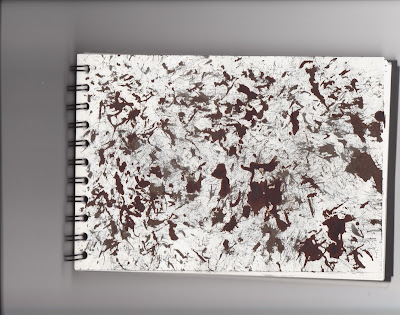
Having gathered together several articles such as kitchen whisks, spoons, coils, nuts, seed heads I have been very disappointed with my results.  I'm afraid I got into a horrible inky mess, with ink running up and down my arms and heaven knows where, so I ended up cutting this exercise short.  I had more satisfaction from tying to make marks with a felt pen and a crayon.  Some of the marks I've made with a grass seed head remind me of Jackson Pollack, who I like a lot.
More felt tip pen marks

Using all sides of a black wax crayon

Coat of Arms
Marks using  black felt pen
More 'Jackson Pollock' using seed heads and black ink
Marks using bottle washer spiral brush and black ink
Felt tip pen marks


Marks made with black in and pastry cutter - the unintentionl blobs of ink seem to have become butterfly shaped.

This is my 'Jackson Pollock' with seed head and end of paint brush marks with black ink


Emotions
Drawn emotions, anger,calm, lust, happy, sad and envy.  The more negative emotions such as anger are tighter in sytle whilst the more relaxed emotion are more open in shape.
The stitched example of the drawing above.  Free machine embroidery.  I didn't use a hoop with this as there wasn't enough space to move the fabric around with a hoop. 


I'm not sure what emotions are expressed in the examples you have stitched on page 72, however the first set of stitching is close and tight so could be anger or another strong negative emotion.  The second sample is more open in structure, but also angular, so could be angry again or maybe sad.

Monday 14 November 2011

Module One, Chapter Seven

Hi there, I know it's been ages since I've done anything but am catching up a bit now.  Have been on a couple of Urchfont courses and booked up 4 for next year.  Had a super weekend making felt recently and am looking forward to fabric fairies and willow christmas decorations in the next couple of weeks.  But now seriously here is the work I've done on free machine embroidery.  I have been looking forward to this and I think it is fair to say that some of the work I enjoyed more than others but I think that is usually par for the course.  Nevertheless I can understand why these exercises need to be done. 

So to begin:

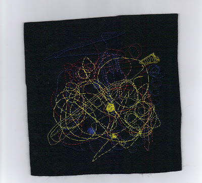
The first sample is the free machine embroidery using a hoop or frame.  Material used is black felt with no stabiliser and the threads are just any bright threads that came to hand.  I machined at fast, medium and slow paces whilst pulling the felt through quickly then letting the machine take over a bit.  It is easy to see that bigger the stitches the slower the pace and the tighter the stitches the quicker the pace.  I like the little piece I've done and reminds me of firework traces left in the sky.  I probably should have done more stitching.  I liked the sense of freedom.

Sample No 1- Free stitching in frame and stitching doodles

Creating a Design

I sketched a design for the next sample based on a photo of an embroidery in September's Stitch Magazine.  This is based on a painting by Van Gogh.

Stitch magazine, embroidery inspired by Van Gogh

Design for Sample No 2


Sample 2 Stitched Design with Hoop


In this second stitched sample a hoop was used, the material is black felt backed with a nappy liner stabiliser.  Threads are reds, oranges, yellows, blues and greens.  I used fast and slow speeds to create different length and intensity of stitches.  I loved just going round and round on the circles and building up colour.  It needs more cirlces and swirls but the hoop was a bit restrictive.  I could do this again without a hoop.


Free Embroidery Without Frame

Sample 3 - Having worked out a rough design as to where I was going to stitch I used black felt again with a vilene as a stabiliser.  Threads as before and tried to stick to the layout in the design.  This was a bit tricky as the lettering and stitching was difficult to keep to size.  Not as enjoyable as the hooped work above and I kep wanting to wander off with the needle. 

Design for Sample 3 Free Embroidery without Hoop

Sample 3 Free Embroidery without Hoop


Sample 4 - Material used was Razzle Dazzle, which was meant to be coloured wine red but turned out pink.  As I have said before my transfer paints are very unsuccessful.  Stabiliser is vilene and the threads are much as before but with some metallics.  I did find myself getting bored with this and tried to fill up the space with large lettering to get it covered quickly.  I like the large red and orange lettering in the middle best.  It could be neater but I found myself a little indifferent about it.

Final Sample 4 - Using Zig Zag Stitch and free embroidery


Wednesday 19 October 2011

Chapter Six - Resolved Sample

Here is my work for Chapter Six culminating in Resolved Sample No 1.  To be honest it hasn't been easy.  My concerns have largely been around feeling 'inspired' to stitch these articles and feeling a bit stifled and it took me forever to decide what I was going to do. However it was my first foray into drawing and making a mock up which I quite enjoyed.  I hope that I will be able to approach the next 'big thing' with more gusto anyway. I was very pleased with the prairie points on page 44 and prefer them to the Resolved Sample. 

The following images are the whole of Chapter Six.  Unfortunately, I have numbered the pages incorrectly and skipped page no. 42. so the sequence is; 38, 39, 40, 41,43, 44,45, 46, 47, 48, 49, 50, 51 and 52.


<><><><><><><><><><><><><><><><><><><>


Write up on Resolved Sample


Resolved Sample of Prairie Points